August 12, 2026 · 4 min read
How to Design a Playlist Cover People Actually Click
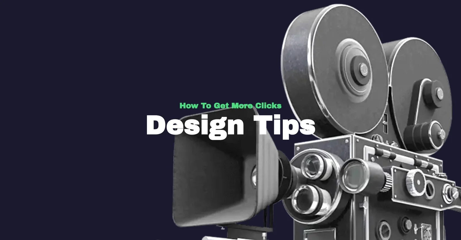
Most playlist covers get seen at thumbnail size, often under 100 pixels wide, in a scrolling grid next to a dozen others. A cover that only works full screen is a cover that loses in the feed. Here is what actually holds up small.
One focal point, not five
Pick a single subject, a face, an object, a shape, and let it fill most of the frame. Covers that try to tell a whole story in one square end up as visual noise once they shrink. If you can't describe the cover's subject in three words, it has too much going on.
Contrast beats decoration
A light title on a dark image (or the reverse) reads instantly. A mid-tone title on a busy photo disappears the moment the cover shrinks. Before you finish, zoom your browser out to 25% and check whether the title is still legible. That's closer to how it will actually be seen.
Keep the title short and bold
Two or three words in a heavy weight beat a full sentence in a thin one every time. If your playlist name is long, consider a shorter version just for the cover, the text on the platform's own listing already carries the full title.
Color sets the mood before anyone reads a word
Warm oranges and reds read as energetic or nostalgic. Cool blues and purples read as calm or late-night. Neon on black reads as electronic or gaming. Pick a palette that matches the music before you pick anything else, it does more work than the imagery.
Build a family, not a one-off
If you run more than one playlist, reuse the same font and a consistent color treatment across covers. It reads as a series and makes each individual cover more recognizable, the same trick album art and podcast networks use across seasons.
Export at the size the platform actually uses
Most streaming platforms display playlist art as a square, 1500×1500px is the safe default. If you're also posting the cover as a YouTube video thumbnail or an Instagram Story, don't just crop the square, redo the composition, a story format is nearly twice as tall as it is wide and a straight crop usually cuts off the title.
None of this requires design software or a subscription. Pick a photo, drop your title on top, check it small, and export.